CS 공부/Data Visualization
Matplotlib 시각화 요소 (Text, Color, Facet)
imsmile2000
2023. 3. 27. 03:01
Text
- Title: 제목/주제
- Label: 축에 해당하는 데이터 정보
- Tick label: 축에 눈금을 사용하여 단위 정보 추가
- Legend: 범례
- Annotation: 그 외 시각화에 대한 설명
fig, ax = plt.subplots()

fig.suptitle('Figure Title')

ax.plot([1, 3, 2], label='범례')
ax.legend()

ax.set_title('제목입니다')
ax.set_xlabel('X축 라벨')
ax.set_ylabel('Y축 라벨')

ax.text(x=1,y=2, s='좌표 기반 텍스트')
fig.text(0.5, 0.6, s='전체 크기 비율 텍스트')

plt.show()
- fontstyle: normal, italic, oblique
- weight: light, normal medium, bold
- size: small, medium, large
- color: 색은 여러가지~
- linespacing: 줄간격
- backgroundcolor: 배경 색상
- alpha: 투명도 (0~1)
- ha: 수직 정렬 (top, bottom, center)
- va: 수평 정렬 (left, right, center)
- rotation: 글자 회전하기 (vertical, horizontal, 각도 직접쓰기)
- boxstyle: square, circle, round, larrow, rarrow 등
#text
ax.text(x=0.5, y=0.5, s='Text',
        fontsize=,
        fontweight='',
        fontfamily='',
        color='',
        linespacing=,
        va='',
        ha='',
        rotation='',
        bbox=dict(boxstyle='', facecolor='wheat', alpha=0.4)
       )

# x축과 평행한 선 -3부터 i번째 학생이 있는 x좌표까지
ax.plot([-3, student['math score'][i]], [student['reading score'][i]]*2,
        color='gray', linestyle='--', # 점선 회색
        zorder=8)

# y축과 평행한 선 -3부터 i번째 학생이 있는 y좌표까지
ax.plot([student['math score'][i]]*2, [-3, student['reading score'][i]],
       color='gray', linestyle='--',
       zorder=8)

#annotate
 ax.annotate(text=f'~~',
            xy=(student['math score'][i], student['reading score'][i]), #i번째 학생이 있는 점에
            xytext=[80, 40],
            bbox=bbox, #박스로 표시
            arrowprops=arrowprops, # 화살표해서
            zorder=9
           )
Color
- 색은 가장 효과적인 채널 구분
- 화려한 것이 전부는 아니다. 강조해야할 부분을 강조해야함
- 범주형 (Categorical): 독립된 색상으로 구성되어 범주형 변수에 사용. 이산적인 개별 값에 적합
- 범주형 색상은 채도와 광도는 거의 일정하고, 색상의 변화만으로 차이를 주는 것이 특징
- 일반적으로 tab10과 Set2가 가장 많이 사용됨

# matplotlib의 color list 가져옴
print(plt.cm.get_cmap('tab10').colors) #0~1 사이의 숫자

# color list를 colormap으로 바꿔줌
from matplotlib.colors import ListedColormap
cmap=ListedColormap(plt.cm.get_cmap(cm).colors[:5]) # 5개만
#qualitative_cm_list = ['Pastel1', 'Pastel2', 'Accent', 'Dark2', 'Set1', 'Set2', 'Set3', 'tab10']
- 연속형 (Sequential): 연속적인 색상을 사용하여 값을 표현. 같은 값에 대해서도 다른 가중치
- Heatmap, Contour Plot
- 지리지도 데이터, 계층형 데이터에도 적합
- 색조는 유지하되 색의 밝기를 조정하여 연속적인 표현을 나타냄
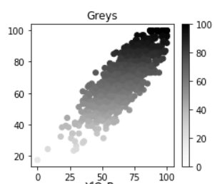
cmap=cm
#sequential_cm_list = ['Greys', 'Purples', 'Blues', 'Greens', 'Oranges', 'Reds','YlOrBr', 'YlOrRd', 'OrRd', 'PuRd', 'RdPu', 'BuPu','GnBu', 'PuBu', 'YlGnBu', 'PuBuGn', 'BuGn', 'YlGn']
- 발산형 (Diverge): 연속형과 유사하지만 중앙을 기준으로 발산. 같은 값에 대해서도 다른 가중치
- 상반된 값(기온)이나 서로 다른 2개 표현하는데 적합

from matplotlib.colors import TwoSlopeNorm
# 0~reading score의 평균값까지=0.5 reading score 평균값~100까지=0.5
offset = TwoSlopeNorm(vmin=0, vcenter=student['reading score'].mean(), vmax=100)
c=offset(student['math score']),
cmap=cm

#diverging_cm_list = ['PiYG', 'PRGn', 'BrBG', 'PuOr', 'RdGy', 'RdBu','RdYlBu', 'RdYlGn', 'Spectral', 'coolwarm', 'bwr', 'seismic']- 강조 Highlighting
- 명도 대비(회검), 색상 대비(파보), 채도 대비(회주), 보색 대비(빨초)
RGB보다 HSL이 중요!
- Hue(색조) : 빨강, 파랑, 초록 등 색상으로 생각하는 부분
- 빨강(0)에서 보라색(350)까지 있는 스펙트럼에서 0-360으로 표현
- Saturate(채도) : 무채색과의 차이
- 선명도라고 볼 수 있음 (선명하다 / 탁하다)
- Lightness(광도) : 색상의 밝기
Facet
- 분할
- 같은 방법으로 동시에 여러 특성을 보거나 큰 틀에서 볼 수 없는 부분을 세세하게 보여줄 수 있음
- Figure 와 Axes
- Figure는 큰 틀, Ax는 각 plot이 들어가는 공간
- Figure는 항상 1개, Ax는 여러개
- 가장 쉬운 3가지 방법
- plt.subplot()
- plt.figure() + fig.add_subplot()
- plt.subplots()
#1번
fig = plt.figure()
ax = fig.add_subplot(121)
ax = fig.add_subplot(122)
plt.show()

#3번
fig, (ax1, ax2) = plt.subplots(1, 2)
plt.show()
Facet의 요소
- figuresize
- dpi: 해상도(기본100)
- sharex, sharey(True,False): 개별 ax, subplots 함수를 사용할 때는 sharex, sharey를 사용하여 축을 공유할 수 있습니다.
- squeeze: 항상 2차원으로 배열을 받을 수 있다 (가변크기 바꿀 때)
- flatten: 배열을 1차원으로 바꿔줌
- aspect: x축과 y축의 비율 (1이면 figure가 정사각형)
Grid Spec: subplot 배치하기
- subplot을 표현하기 위한 2가지 방법
- slicing (선호함!)
gs = fig.add_gridspec(3, 3)
ax[0] = fig.add_subplot(gs[0, :])
ax[1] = fig.add_subplot(gs[1, :-1])
....
2. 시작위치 x,y와 차이 dx,dy로 표현: fig.subplot2grid()
fig = plt.figure(figsize=(8, 5))
ax[0] = plt.subplot2grid((3,4), (0,0), colspan=4)
ax[1] = plt.subplot2grid((3,4), (1,0), colspan=1)
...
- Ax 내부에 subplot 추가하는 방법 (ax.inset_axes())
- 미니맵 형태로 추가
- 외부 정보를 적은 비중으로 추가
fig, ax = plt.subplots()
axin = ax.inset_axes([0.5, 0.5, 0.3, 0.3])
plt.show()
- 그리드를 사용하지 않고 사이드에 추가 (make_axes_locatable(ax))
- colorbar에 가장 많이 사용
from mpl_toolkits.axes_grid1.axes_divider import make_axes_locatable

fig, ax = plt.subplots(1, 1)
ax_divider = make_axes_locatable(ax)

ax = ax_divider.append_axes("right", size="7%", pad="2%")
plt.show()