Polar Plot
- 극 좌표계를 사용하는 시각 (거리, 각도 사용)
- 회전, 주기성 등을 표현하기에 적합
- 주로 scatter 그래프 (Line, Bar도 가능)
- projection = polar을 추가하여 사용
fig = plt.figure()
ax = fig.add_subplot(111, projection='polar') #fig.add_subplot(111, polar=True) 해도됨
ax.set_rmax(2) 반지름 max값 2로 조정
# ax.set_rmin() 반지름 min값
ax.set_rticks([0.5, 1, 1.5, 2]) 원하는 위치에 값 표시
plt.show()

#set_rlabel_position: 반지름 label이 적히는 위치의 각도 조정
#부채꼴로도 표현 가능
#set_thetamin() : 각도의 min값
#set_thetamax() : 각도의 max값
왼쪽(위 코드), 오른쪽(아래 코드)
#scatter(theta,r)
#bar(theta,r)
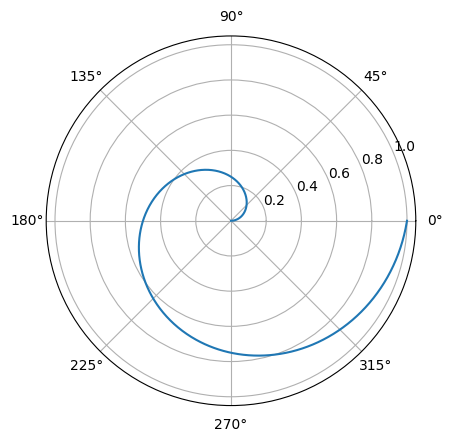
np.random.seed(19680801)
N = 1000
r = np.linspace(0, 1, N) #0부터 1까지 N등분
theta = np.linspace(0, 2*np.pi, N) # 0부터 2pi까지 N등분
fig = plt.figure()
ax = fig.add_subplot(111, projection='polar')
ax.plot(theta, r) #ax.fill(theta,r)하면 그래프 채워짐
plt.show()
Radar Plot
- 극 좌표계를 사용하는 대표적인 차트
- 별 모양으로 생겨서 Star plot으로 불림
- 중심점을 기준으로 N개의 변수 값을 표현 가능
- 데이터의 퀄리티(운동 선수 비교, 캐릭터 능력치 비교 등) 표현에 좋음
- 각 feature가 독립적이며, 척도가 같아야 함
- feature가 많아질수록 가독성이 떨어짐
fig = plt.figure()
ax = fig.add_subplot(111, projection='polar')
theta = np.linspace(0, 2*np.pi, 6, endpoint=False)

#value와 theta에 맨 처음 값을 맨 뒤에 추가해줌으로써 끝점을 포함해서 연결시킴
values.append(values[0])
theta = theta.tolist() + [theta[0]]

ax.plot(theta, values)
ax.fill(theta, values, alpha=0.5)

#ax.set_thetagrids([n*60 for n in range(6)], stats) 각도 6개로 나누기 (60도씩 6개)
#ax.set_theta_offset(np.pi/2) 시작각도 변경(여기서는 90도)
plt.show()